Back in June 2011, we spoke to Manta Ray Comics founder Pratheek Thomas about the indie publisher’s critically-acclaimed debut graphic novel Hush. The Manta Ray team has been busy since then, with regular appearances at comics conventions and publishing short comics in publications such as Mint, Forbes Life, and Motherland. Mixtape is their latest initiative, an experimental series of short comics anthologies featuring work by upcoming and established Indian artists and writers.
Read on for excerpts from an exclusive interview with Manta Ray’s Pratheek Thomas and Dileep Cherian about Mixtape and the publisher’s plans for the rest of the year—
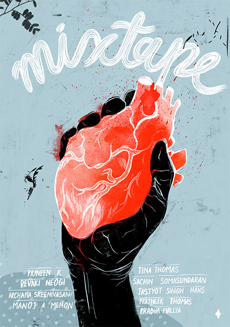
“Mixtape is an experiment that we’re doing.”
What is Mixtape all about? Where and when and how did the idea originate?
Mixtape is an experiment that we’re doing. The idea is to showcase short comic stories from new, upcoming, and established creators in a comics anthology that comes out every two months or so. All the creators are doing this pro bono, and ALL the revenues from the digital sales of the comic go back to the creators, Manta Ray does not keep anything.
Mixtape was one of the three projects that has been there since the inception of Manta Ray (the other two being Hush and Twelve). We were inspired by international anthology comic collections, especially the Flight series (edited and curated by Kazu Kibuishi), and we’d always envisioned it as a platform for new talent in India.
How long have you been working on bringing the idea to life?
Well, the truth is that we’d been hibernating since Hush came out two years ago, and had only done one other mini-comic—Love Like a Sunset—which we took to conventions. We’ve been creating The Small Picture in Mint and short comics in Forbes Life and Motherland, but we were rearing to get back to creating our own comics. And we decided to give Mixtape (and digital) a try. The initial discussions on Mixtape started in August last year when we talked to our creator friends, and it took us about three months to put together all the stories and the book.
You’ve referred to the project as a “raw version of Manta Ray”.
Anthology collections, by virtue of their content, are never perfect. It’s true for a book of poems or short stories or a collection of short films. Some stories you’ll like, some you won’t. So Mixtape is not a perfect collection. That’s one aspect of the ‘rawness’.
Also, the idea is to feature new and upcoming creators. Many of them are still figuring out comics, experimenting, learning the craft, and there is bound to be a ‘rawness’ in their work. We are hands-on with the creators we showcase, the editorial team gives feedback, may suggest ways to tighten or tell the story in a better way… the goal is to help the creators tell the best stories possible. And, the more stories they tell, the more refined their storytelling becomes, and the stronger stories they’re able to tell.
The first issue of Mixtape is priced at a mere Rs. 55. It was initially promoted as being a comics anthology for about the price of a cup of coffee (although it’s hard to find a good cup of coffee for that much, these days). Has the low price reflected in increased readership and sales?
These ‘Digital Firsts’ comics we’re rolling out is an experiment, and I think it’s too early for us to take stock of the results. It’s been just six weeks or so since Mixtape 1 came out. And no, the numbers haven’t set our world on fire. But that’s okay. Six months, a year from now, that’s when we’ll really know how this experiment has done.
The collaborative aspect of an anthology like Mixtape is obviously great for writers and illustrators working on stories for each issue. However, anthologies of short comics/graphic stories are notoriously difficult to market, especially in a digital, D.R.M.-free format as you’ve done with Mixtape 1.
Well, traditionally (in the U.S., that is), anthology comics have been a tough sell, until Flight came along and proved it wrong. But in India, comics itself are so niche, I wonder if it works the same way here. What I mean is that for a small, indie publisher like us, we wouldn’t have a big marketing budget whether we were doing an anthology like Mixtape, a one-shot like Hush or a series like Twelve. Readers know about our comics via our newsletter, social media, by word of mouth, and when it’s reviewed in the mainstream press, or showcased online, like in this interview, for example.

I think that without huge budgets, it is notoriously difficult to get noticed in print: the way distribution is today, the way stores stock comics (if they do at all), and with people buying more on online stores than from physical bookshops.
Digital, on the other hand is not constrained by any of these ‘physical’ barriers. And also, anyone in the world can download and read it. In fact, we’ve just started sending Mixtape to international creators whose work we follow and respect, and the early response to it is truly exciting.
As for D.R.M.-free, that is a conscious decision too. Firstly, it’s ownership. It’s not stuck in a device or on an app—both of which could cease to exist one day. Two, you can print it out and make a book for yourself. Thirdly, it’s about sharing. We share the things we like with our friends. For example, we’ve all shared the books, movies, music we love with our friends, and this is something we did even before the digital versions of any of these existed. So if someone likes Mixtape so much that they’d like to share it with their friends, that’s great, because we get to reach out to a new set of readers that way.
Do you have a long-term goal when it comes to Mixtape, in terms of sales, readership, and what it can do for you as an independent publisher of comic books in India?
We’re going to take it one step at a time. Over the course of the next 12 months, we’re aiming to bring out a total of five or six Mixtape issues (and an equal number of Twelve(s)). So that’s roughly a comic every month this year. If we’re able to do that, if we can consistently keep up the high standards we have set for ourselves, then we believe that it will lead to more readers. That’s the key for us, to reach out to a larger audience, both Indian and international, to tell stories that we want to tell that also resonate with our readers.
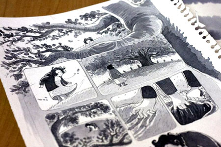
A rough cut of Rather Lovely Thing, featured in Mixtape 1.
As with Hush, the stories featured in Mixtape 1 are all in black and white (with the odd splash of red, as seen in Rather Lovely Thing) and contain very little text, if at all. Was that a conscious decision, or did it just happen that way? Will future editions of Mixtape feature graphic stories along similar lines?
The ‘silence’ was not a conscious decision, it just happened. However, the black and white is a conscious decision. We use colour only when it is absolutely necessary in the storytelling, not otherwise. In Rather Lovely Thing, the red really added to the story. Also, we want to do small print runs of the Mixtape issues, and the black-and-white will help us keep costs down when we do that.
I cannot say if the future editions of Mixtape will feature silent stories like Issue One did. It all depends on the creators and the stories they tell. But the centre-piece story in Mixtape 2 (Pursuit, which was previewed in Mixtape 1) has very little text in it.
Do you see the digital format overshadowing printed comic books in the near future?
I think the reach of digital will be far more than print. Actually, digital comics have been around for a long time, in the form of web comics and the pirated scans of print comics. What has changed is the proliferation of tablets (especially the iPad, with its large screen) that makes reading digital comics so much more easier than it is on a computer screen. So, an entire ecosystem of apps has grown around the devices and platforms, and access has increased tremendously.
At Manta Ray, we love print, but we know that digital is going to propel the future. We’re going to do print for our comics, but the way we approach it will be different. It could be on a pre-order basis, or print-on-demand… so the fans who truly want to have the print copy, we do it for them.
One of the most amazing things that comics publishers are seeing in the U.S. is that digital has not cannibalised print (as it was expected to). Instead, the sales of both print and digital [comics] have grown side by side. I think digital gives an unprecedented reach over print comics, and of course unmatched portability. But, the titles and stories you truly love… I think readers are likely to buy the physical copies of these—they are for keeping.
You’ve mentioned that 2013 is the year of Twelve, your upcoming limited series of graphic novels. What else is on the cards for Manta Ray?
Twelve is one of the big stories for us in 2013. It’s a series that we’ve been working towards for some time now; we’re really excited about the stories we’re telling in it, and we are collaborating with some of the best illustrators and artists on this series.
We’ll be completing two years of The Small Picture in August, that’s a big milestone for us. We’re working on our fourth short comic with Forbes Life at the moment, and it’s a wonderful partnership we have with them. We’re also discussing short comic projects with some more journals and we’ve done a piece in volume two of The Obliterary Journal (Blaft).
We’re looking at a couple of graphic novel projects this year as well, though it’s too early to say anything about those.
Artists’s Thoughts on Mixtape 1

Mixtape 1 cover art and publication design; lettering for Voyeur
The experimental, raw Mixtape comics anthology has so much in common with the concept of a music mixtape: each story a song and each volume a selection of handpicked stories recorded in a certain order. The book is designed to echo the look of all those old well-loved blank cassettes on which we painstakingly created our own volumes of music and ideas and stories.
Lettering for Voyeur was real fun. As one can’t see what’s going on in the lettered pages, but can only “hear”, the perceived “volume” of the sounds and their position on the page would be key indicators of what was going on on the other side of the wall. The story carries these interesting and completely contrasting ways of comic storytelling: there are pages full of illustrated panels with not a spoken word on them; and then these two dark pages with nothing but lettered dialogues on!
The story Rather Lovely Thing was the inspiration behind the cover [of Mixtape 1]. I’d made the illustration based on the earliest version of Pratheek’s script, from an idea that Pratheek had that was just waiting to be drawn. I hoped it wouldn’t give away too much of the story; yet it represents a key moment in it. But it also stands for the book as a whole, for the process of getting the book, these stories, out in this very raw way is a crazy, heartfelt and bloody exciting thing for us to do.
———

Art for Rather Lovely Thing
Pratheek and I are long-time buddies. We’ve spent a lot of time working together. Pratheek generally places a great deal of faith in his artists, and doesn’t micro-manage or nitpick. And in our case, the synergy is even better because we’re friends and can grasp quite quickly where the other one is coming from.
When he emailed me the script for Rather Lovely Thing, I fell in love with it at first read. I felt a strong connect with it, and could visualise the story quite clearly. I had a day job then, and soon after I read the script I felt inspired to just sit down and start work on it right away, but that didn’t happen. In fact, it took me a good two months to free myself from other work.
I don’t remember Pratheek and I having too much back-and-forth while working on the art. It was quite a smooth ride. The only point where we deliberated a bit was when we were trying to picture the age of the woman. Initially Pratheek wanted to have a young, pretty-ish girl, but we decided eventually to have an older woman because we felt that adds more depth to the story, and probably makes it graver.
People have told me that this is one of my best works to date. I’m very pleased to hear that, more so because I enjoyed creating this piece so much. People have also told me that this reminds them of Ryan Andrews’s comics. That’s a huge compliment, and certainly, Ryan Andrews has been an inspiration for me. In fact, the man himself was kind enough to give me some very detailed feedback on Mixtape and Rather Lovely Thing!
———

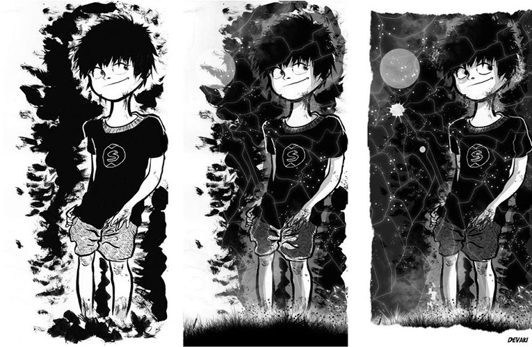
Cover art for The Silver Spider
If I correctly remember, this was during Comic Con 2012 at Bangalore and we were all getting prepared. I spoke to Pratheek over the phone about the project and he told me that [The Silver Spider] was a grim tale and it was about spiders and a naughty boy. That was it.
My first attempt [at the cover] was an inverse of what is printed right now—more like some line art of a spider. But then I decided to hide the spider and keep it ‘camouflaged’. I thought of wilderness, leaves, bushes while we were inching closer towards the deadline.
I felt that there must be something sinister in the story that the spiders have to do. So I kept the boy in the wilderness, with webs on either side. [It was] all set in the dark and I had the line work in white because there was no way I could think of showing the silvery sheen otherwise. I had the [boy’s] eyes drawn big and white, like they were hypnotised by something, and I portrayed him like he was lost in the woods. One thing was for sure. I didn’t want to show the arachnid in its full glory. I felt that it would be a little cliche. So I framed the silhouettes within the form and I wanted ‘loose end’ webs here and there… and I was done!
While doing all of this, I had no clue as to what the story was, because I never read anything. I mean it.
A day later while I was doodling at the Manta Ray Comic Con stall, I asked Pratheek what the story was, and he told me. I was like, “Really? Jeez, wow! That was close!”
———

Script for The Silver Spider
Mixtape was an idea which Pratheek first mentioned to me many years ago, when Dileep and him started Manta Ray. He was quite clear about what he wanted for Mixtape: a diverse range of stories, which can be brought to life in about six to eight pages of illustrations. This also because the entire comic was being done on a pro bono model and we didn’t want the illustrator/artist to spend a lot of time on it. The writer’s job is much easier in this medium of storytelling, unlike the artist who really has to put in a lot more time. It was a very experimental concept, and we wanted to see how an entire comic in a digital format would succeed in reaching out.
Because it is a bouquet of stories belonging to different genres, Mixtape offers the opportunity to tell a bizarre or even a surreal tale. The Silver Spider was one such tale, and it was originally written as The Boy Who Peed on Spiderwebs and The Revenge of the Silver Spiders, a split short story written about five years ago. The story is based on the real-life tale of a boy who was bitten by a spider and was transformed into infinite silver spiders! You don’t believe me? Wait till you get bitten by one.
Pratheek introduced Devaki (artist for The Silver Spider) and I, and the three of us took it forward from there. I am sure I am speaking for Pratheek as well when I say that we were blown away by the first page that Devaki sent across, which very detailed and captured the mood perfectly. This detailing of Devaki’s illustrations is the strength of this graphic short, where, with every reading, you will discover some new detail in the story. And some of the techniques of colouring that she has used brings out the surreal nature of the space—the spiders and such.
The biggest perk of working on Mixtape, apart from the fun of doing it, is the opportunity to collaborate with a diverse and hugely talented group of passionate artists: storytellers, writers, illustrators, and more than anything, story lovers. The feedback that we have received from various quarters reinforces our belief that Mixtape has been successfully with its objective: there is a story in it for everyone.
———

Art for The Silver Spider
The Silver Spider was brought over [to me] by Pratheek with the idea that it was going to be one of the stories in the anthology. It was one of those stories where the climax was the most important factor. I felt that when I read it, I should feel what the actors are trying to do in the plot. What I liked about this story was that it is about a mentally twisted child. The fact that it was black and white was an exciting aspect as well. The most rousing part of the story was the transformation of the boy into the spiders.
I like it when kids are not very sweet and cute—[they should be] intelligent and inventive, but not cute. The ‘character sketch’ was the stage where the main character needed to be fleshed out. For this, I recollected the images of the kids back in my hometown, and from interior parts of Karnataka where I had travelled. From my memory of them, I wanted to bring in a dishevelled, torn, playful look. This led to my coming up with a kid—someone of whom you could always believe that he would never be up to any good! And kids sometimes aren’t, which is what happened here in the story.
As the story was called The Silver Spider, I read up about silver spiders when looking for pictures of them online. I kept the art graphical, and the use of grey shades and tones was necessary to bring out the light and dark, as in day versus night, which is an important accompanying element to the plot of the story.
———

Script for My Beloved
I started writing My Beloved as a short story in Malayalam in early 2012. I always wanted to write a silent, subtle story on lesbianism with a contemporary setting. But honestly, I had no idea of how to get a publisher or where to publish it. I just kept writing the story I wanted to with the sheer hope that more stories compiled together would lead me to a publisher in Kerala. After finishing the first draft, I showed it to Pratheek, who had no plans of bringing out Mixtape then. He liked the story and asked me to do it as a comic, as silent emotions can be conveyed much more effectively using visuals. Thus the rebirth of My Beloved as a comic happened, and when Mixtape started taking life, it became part of the book.
Having seen his cover for Love Like a Sunset and the endless gorgeous women on his blog, I was certain that Jasjyot [Singh Hans] had to be the artist for My Beloved. Though from other part of the country, he easily cracked the Malayali settings the story asked for and the girls—I have to say, their salwars, hair, kajal, and even bindi were just perfect. The only place we had slowed down a bit in the whole process was for the dialogue. Being originally written in Malayalam, it took us a while to capture the correct expressions for it. We even thought of dropping the dialogue or translating it to English. But eventually, we went ahead with it without any compromises and that added a lot to the story, we believe.
———
Click here to read more about and purchase Mixtape 1.


